Showing posts with label work in progress. Show all posts

Sunday, March 11, 2018

Magazine Model App, a distraction from making art

APP PHOTO OF MOI: makeup and airbrushed to make me look like a magazine model
If you want to try out their APP, CLICK HERE to do it

So, I had some fun with an app one night that makes one look like a magazine model. It's floating around, and a lot of people I know have tried it. 

There are a lot of these kinds of apps these days: what you'd look like if you were a man, for instance. Never tried it. In fact, I never try any of them because downloading an app usually means a lot of unwanted junk gets loaded onto your computer and then you find that you often want to remove it (if you know how to). 

In the original photo I'm not wearing any make-up at all, not a speck of it, so what I look like with  makeup is accurate. The airbrushing is what takes away the details of your face: the subtle dimples on the side of my face, the few extra lines under my eyes, the higher plumper cheek bones that I have, and everyone I know who has tried the app says it whitens the eyes around the pupil. Yup. But I understand that this is what is done to fashion models and to Hollywood stars posing for magazines. Glam is all of the rage.

Would I be happy with the results if it was for an actual magazine shoot? Probably, as a photo, but I actually hate to wear make up. I don't like the way it feels, and mostly I feel phony and not myself when I have it on. Close-up, too, eyelashes clump together in a kind of shiny gooey way. 

For performing on stage, I do wear a brown eyeliner and a lipstick that matches my own lip color which is naturally a rosy color (the lipstick smooths out the color). 

Here is another photo (taken from the photo in my banner atop this page) -- again, in the original photo I am not wearing any make up at all, and yes, my side dimples aren't apparent in the mag one either:


This one is from my website: 


Here are a couple more:


I have just finished a painting this morning and will be loading it very soon. 

Monday, June 29, 2015

Beltane 2015 and how it ended up looking like something out of Hieronymus Bosch

bonfire set to go for Beltane 2015!
(Beltane wouldn't be complete without a bonfire and this one has two bonfires)

This is to celebrate and dance away the dark spirits that have been around since Halloween! 

To learn more about Beltane, which is an olde Celtic celebration, go here to a Wikipedia article about it.

This is a continuation of this post about Beltane 2014, and about this post where I promised to post about 3 events in succession. The three events include flag day (where taking pictures of the parade resulted in an art piece called "Followers as Zombies" view-able here), Beltane (this post, which resulted in an art piece that resembled something out of Hieronymous Bosch) and a Renaissance faire (yet to be published).

I sometimes use photos from events for my art. In my particular case, I probably will use more of the flag day photos and Renaissance faire photos than the ones from Beltane, though I am liking this year's crop of Beltane photos more than last year's and you never know what will spark the inspiration.

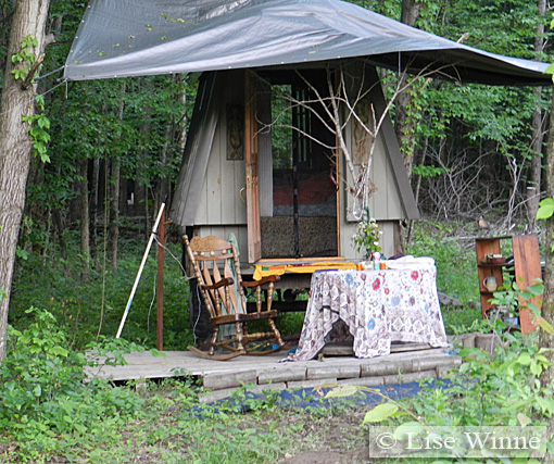
Before the bonfire gets lit with a torch thrown from a medieval-style catapult, I take a walk through the woods and find that there is a rather large campsite. Most of the camps are tents, but I found this cool caravan, complete with a couple of sculptures nailed to either side of the door:

  caravan camping complete with cozy bed inside
and two ceramic sculptures adorning the outside on either side of the door --

The whole caravan sits on a trailer bed and has modern wheels for a modern highway even though it looks like something from the 1600s - 1800s. This is much nicer to look at than a modern trailer made out of metal and plastic parts! It is very much a mini home and can fit a double bed, the rocker and shelf unit (though I have yet to find out where the small round table can fit ... and on closer inspection, I realize it is a spool, with two round circles on either end, and just fashioned to be a make-shift table for the present).

I noticed two caravans for Beltane this year (last year there was only one caravan, so the new trend seems to be taking hold)!

Then as I go back to the gathering, I notice it is getting dark. So I take a picture of one of the two statues that adorn the gate before the night descends:

sculpture guarding the gate
before dark

In the other post that I wrote, I told how this event takes place at an artist's studio, and his sculptures are everywhere! They are included in everything, even the place where wood is stacked, on carts, where there is a tree growing, where there is an entrance, anything is deserving of a piece of sculpture. For Beltane, the torches are placed in front of the sculptures.

So ... when night arrives the torches illuminate all the sculpture faces (like this one):

 the torches are lit!
the faces all glow in the dark!

Then the bonfire gets lit with fireballs thrown from a hand-built old style catapult up on a hill:

the bonfires are lit by fireballs catapulting into the wood piles


the celebration is on!
the drumming starts!
the dancing starts!

everyone moves a little closer to the fire!


I liked how this guy's profile was framed by the fire:

profiled by fire!

I love the effects of some of the pictures once it is dark! So much better than last year's photo shoot! These guys look like aliens (grays) with their tight suits and hoods. I like how these three figures move, and how they leave trails (because of the low light and long shutter speed):

three figures 
who look like aliens!
and dancing!


Then the fire dancers get started:

the fire dancers start!

and keep going!

and going and going and ...

and going!

There was a little more light made by the bonfires for this next photo, and I like how I'm getting shadowing with all of the figures. Faces begin to take on other-worldly appearances:

fire dancer with on-lookers

And then a guy with horns starts fire dancing too. I love how his glasses are reflecting the fire from his hands and the satisfied smile he seems to wear:

man with horns fire dancing!


another one

... And then he starts to eat fire (!):

fire eater with two fireballs

fire eater in full glory!


The following are my favorites of the night:

This is probably my ultimate favorite of the night! I like the composition and how the figures are moving. This one will have to be relegated to a painting. I don't know how to improve upon the photo itself at this time:

gathering

This one looks like ghosts. The squiggle is somewhat distracting, and I contemplate whether to take it out digitally. It has that Duchamp look to it (reminding me of Nude Descending a Staircase), but there is also something about it that only photography can do

ghosts with light squiggles

I take a portion of the photo and play around with it:

ghosts moving, doing their thing

So odd! Whoa! Weird things start happening in the dark, I guess!

It looks like some of the figures are in a bath tub! There was no bath tub, I can assure you! There's also a brown fish coming out of the side of it (front center). And then there's this cubist thing happening in the left corner! The figures ears are pronounced, and you can tell where their hairlines are, but other than that there is a mystery surrounding this perspective and the one preceding it.

I know that these photos were taken near the drumming circle, but other than that I can't remember what was there.

The one thing I left out of the above one was a full perspective of the tree. Perhaps that is what is most interesting about the photo. The tree and figures appear as one:

"Ghosts Holding up the Tree of Life"

This one looks like a Bacchanalian freak show:

"Bacchanalian Freak Show"
(take one)

The most interesting figures (to me) are off to the right. So I focus on them for this next rendition: 

"Bacchanalian Freak Show"
(take two)

It can't get much better than this!

... Or can it?

I go into the photo and try to emphasize the facial features and some of the hands.

Wow! Now it is looking like something out of Hieronymus Bosch (!):

"Bacchanalian Freak Show with Hieronymus Bosch treatment"
(final)

Next up is a Renaissance faire.

Wednesday, June 17, 2015

flag day parade photos and art, 2015

Flag Day Parade
© 2015

I had a very active weekend in terms of taking photos, which incidentally, I use for my artwork.

I use them in all kinds of ways, for figure references for paintings, for digital art, for composition ideas, or I use them just the way they are with a little fussing. 

First I took pictures at a flag day parade. Then Beltane (which was celebrated late this year). Then a Renaissance Faire. I will put up three posts in succession so you can see them all, but I am being very choosy about what I feature for flag day and for the Renaissance faire. The reason? I am already using them as references for some art pieces and I want them to be a surprise. So for those two events, I am picking pieces carefully.   

Did I have a blast at all of these events? You betcha!

So anyway, sometimes I like to play around with a photo first to see if it has a good composition. This is how I do it, by just using the shapes (also adding a little texture so it isn't so boring):

Flag Day Parade
(experiment)
© 2015

This gives me an idea if I like how the elements are arranged. It simplifies everything too, taking out extraneous details I might not like in my painting. 

I like this composition! The lone figure is framed by all of the other figures, making her the focal point. In the photo, she is facing away from me. In a painting, I might have her facing towards me. Or I might have her protesting something. Or I might put another kind of figure altogether (like an animal).

I definitely won't use the photo as is.

Here is another that caught my eye (as a photograph). I like a lot I like in it, and by spending time with it, and exploring each part of it, I start thinking of possibilities... 

 Flag Day Parade II
© 2015

At first, for this one, I experimented with making it look like an old postcard, bringing out some contrast! They do look more dignified, like they'd have the manners of people in 1940s small town America:

Flag Day Parade II
(experiment to make it look like a bygone era)
© 2015

Anyway, I like this composition too. The flag on the building and the leading man seem to be the focal points, and the wall of followers support the theme. What I don't like is missing the individual faces and expressions of the crowd. There's a lot of emotion that gets lost. We see the crowd behind trying to march in unison, all wearing the same colors, but that's about it. Who are these people? Why do they walk so far behind their leader? They are at too much of a distance.

So I took the left corner of the photo and did this (adding a painterly style filter):

Flag Day Parade II
(detail with painterly style)
© 2015

Now all of a sudden, we have a different leader, even though she is in the same photo! Obviously there is a leader behind the leader!

Interesting, but I felt the work still needed something. How could I give it meaning or a statement?

So I began to think about defining the piece in terms of leader and followers.

Do people think about who and what they are following? Or do they do it unconsciously? Is it good to follow anyone? When people look at a group of people following someone, what are some attitudes about followers? Do people on the sidelines think more about the leader before they think about the followers? Are leaders necessarily more important? How often do we follow someone when we really don't want to? Do we sometimes find it shameful and abhorrent? Do followers sometimes act like zombies, as if they've given into someone or an agenda?

I can see two people in this photo who are definitely acting robotic.

In this photo, the leader is clearly defined: she is the only one dressed up, and she has a livery collar like royals from the 1400s wore. The people behind her are in casual wear, though it is obvious they were "told" what to wear: white shirt with black skirt or pants to mimic their leader. At any rate, they don't look so dignified and upright as the leader. They are trying to keep steps with her, and echo the colors she wears, but in general, they look decidedly more rag-tag.

So I tried to put her even more in the spotlight by making her flesh coloring different than her followers. For the followers, I give them cooler coloring which makes them retreat into the background even more. I gave them slightly different facial expressions than the original too, so they'd look slightly ghoulish. I also made the black clothing out of a silk satin type of material. I went further with this (epilogue below this first attempt):


Followers as Zombies, "take one"
(detail of Flag Day Parade II)
© 2015

Notice that I changed the title as it no longer has to do with flag day!

Epilogue (written on June 27, 2015) ...
So after I thought I had finished this piece, I kept thinking about it. I felt I needed to put her in a royal velvet color (like dark red), turn her livery color into gold and dress it up with gems. I also put a crown on her head. This makes her a bone fide royal!

Some of the zombie coloring seemed too bright (popsicle colors) and the background reds were distracting too.

Notice I also changed the sign to say "ENTER CITY" instead of "CITY CENTER".

So this is the end result:

Followers as Zombies
(final)
© 2015


Monday, March 23, 2015

Artfire does a Regretsy, and movin' on up!

An advertisement on one of my ornament listings for a factory-made ornament
(note: this is something that was done by Artfire, not by me!)

(note on 4/27/15: Artfire added an ad-free option a week ago from all of the complaints from sellers about the ads. I took Artfire up on the offer to keep ads out of my shop, and I now feel okay about sending buyers there ... for now. I am still setting up my own e-commerce website, but at least I don't feel rushed, and can do it at my leisure. The rest of what I wrote, below, is the original post)

As many of you know (especially my loyal brick and mortar customers), I have been selling on Artfire for awhile now. The site was looking better than it ever has, it had gotten mobile friendly, and then, wham! Ads!

No, I did not want my listings for my handmade and fine art to be blasted with ads looking like an ad farm

And no, I will never put ads with handmade, fine art listings. And believe me, I could make this blog cluttered with ads too, and make good money doing so, but I have never taken that route because I don't believe it is respectful to my customers and it goes against everything small businesses and artists stand for. 

I liken the ads on my listings to this scenerio:

I shop for food primarily from local farms. I actually drive to a lot of farms. I love the drive to the farm where I buy my eggs for three dollars a carton, for instance. They are lovely eggs by the way, all different colors, by all kinds of different breeds of chickens, and some of them even duck eggs, and so much fresher and better tasting than stale grocery store eggs. This farm is a place I love to go to because of the lovely scenery, where I can meet and pet the chickens who produce my eggs, where I chit-chat with the owners and where I can walk around admiring the wildflowers, horses and cows. Sometimes I see herds of deer mingled in with the cows, or off in the distance. You can see at least a hundred miles into the distance on sunny days. Imagine one day I pulled up and there was a big billboard for "cheap eggs, only a dollar, at your local Walmart" stuck to the chicken shack, and many other billboards and signs blocking the scenery, making it confusing about whether I was buying their farm eggs or ones from a factory farm. Ick!

Well, that's how I feel about the ads on my listings.   

I had been planning to move to my own site in the autumn because I needed to offer wholesale and I couldn't do that on Artfire. I had to use it as a kind of e-mail service and explain everything, rather than have it spelled out in a listing (and imagine how much more confusing it is with these ads for wholesale buyers!). Anyway this has precipitated a need for a fast move, hopefully by next month. I spend my evenings copying listings when I am not trying to keep supplies of greeting cards and other art products stocked for brick and mortar shops in my area. So, I will let you know soon where I have moved to. Here are some other ads they plastered to my handmade ornament listing:


 NO THANKS!

As for other movin' on up plans:

I am also busy creating listings for Fine Art America because most of my customers contact me for print sizes I don't have listed, to get a custom size/order. Having a shop on Fine Art America will make it so much easier for ALL of my customers to order a myriad of sizes on different mediums, even huge 40 inch canvas prints. There is so much I can't do in my own home-based printing business; I have had to farm a lot out. This will give everyone a chance to own any size they want, and on any medium from archival canvas prints, to archival fine art paper, to posters for a kid's room, and greeting cards, and other products. This is a shop I was focusing on launching until Artfire distracted me, and now it's almost like a race to see which site gets done first, my e-commerce store or the Fine Art America store. The stores will probably be done in close proximity to each other!

As for Etsy, I am not invested in running any kind of major store there for my handmade or fine art. If you want to know why, this article explains my views. In movin' on up, I am by-passing venues. Etsy is being relegated to tiny experiments for different kinds of themes. Right now I have focused on a handful of owl listings.

Other things I am working on:
I have some Easter listings to show you soon.
I am doing illustrations for a book (someone else is the author). That's all I can share now.
I will be offering a lot more Victorian designs on the new website, but still keeping most products focused on story-book art, Celtic designs and Renaissance inspired art. 

Just because I have been silent does not mean I haven't been working extremely hard!

NO LINKS TO ONLINE STORES FOR NOW
   

Thursday, June 21, 2012

back to the drawing board...


If you've been following my story, I created 4 paintings to gain entry into an art exhibit in my area. The series of 4 paintings is HERE.

Well, I didn't get in. There are a couple of things that I think definitely worked against me: 

1. My work wasn't consistent enough. I had 3 watercolor paintings and 1 acrylic painting. All of them, except for the two chicken paintings, look like they could have been created by different artists. This is definitely a no-no when trying to get into contemporary art exhibits. The body of work should look like it all goes together with a similar style and treatment. The artist's personality and originality should shine through each work and look like it all belongs together. I knew this, of course (having been an art teacher).

2. The theme wasn't developed enough, creating even more inconsistency. One of them is in the realm of fantasy (the one with the big flowers), one is more in the realm of realism and the others emphasize borders. I was just too all over the place. I believe I would have had a better chance if I had stuck to one particular way of working within the theme.   

3. I didn't give myself enough time to create a body of work. I was rushed. This year has been marred by medical crises and illnesses, whether mine or someone else's. Being distracted does not bode well for making a consistent body of work where some leisure can bring thoughtfulness and reflection. Instead I was overwhelmed with too many things on my plate to think clearly about what I was creating. I thought I had enough time to paint 4 acrylic paintings and 4 watercolor paintings (for instance) and choose between the two mediums. 

4. Not enough pieces:  the prospectus called for 4 - 10 pieces. I'm sure most artists went more for 10 which put me at a disadvantage too.   

5. politics: I think there is always a little of that in the jurying of every exhibit (especially in an area like this where most artists know each other, or at least each other's work). Some artists specialize in farm scenery and it is all they do -- full time. This is not my main focus even if it is becoming part of my palette.

In a way, I am glad I didn't get in especially as I am still dealing with #3 and still greatly overwhelmed to the point where I'm even shutting down my Etsy on-line store for awhile to get back on my feet. Assuming that brighter days are ahead, I will reapply next year. This gives me an entire year to paint and to explore what direction I want to take this work. Working in watercolors and acrylics should be possible too with so much time ahead of me assuming I can get most of my graphic work, greeting cards and music done during the day time. 

Anyway, I hope you have enjoyed reading about my journey so far...


Sunday, October 16, 2011

distractions

sneak peak

I have been very distracted by house issues, but I hope to be blogging again soon. The above photo is representative of some pieces I have been working on since January. I just have to find time to photograph it all.

Just wanted to let my readers that I am still here and hope to be back at my regular routines of making art soon.

In the meantime (in my spare time when I just needed to relax), I put together these Etsy treasuries:


And here are my own links:


MY ART IN ON-LINE STORES:

MY MUSIC IN ON-LINE STORES: