Showing posts with label graphics. Show all posts

Monday, August 8, 2011

tote bag design for gallery phase two

If you want to see phase one of this tote bag design, you can click here to be taken there.

So, here is version two (the version that the Valley Artisans Market Business committee chose) with "Cambridge, NY" underneath the Valley Artisans Market logo.

I did four versions of colors for you to choose. Please keep in mind that various monitors will display colors differently.

Here is the first:

 Valley Artisans Market tote bag design
in dark maroon
(click on image to see a less blurry version)

Here is the second:

Valley Artisans Market tote bag design
in medium maroon
(click on image to see a less blurry version)

Here is the third:

Valley Artisans Market tote bag design
in red maroon
(click on image to see a less blurry version)

Here is the fourth:


Valley Artisans Market tote bag design
in red
(click on image to see a less blurry version)

Keep in mind that the fourth version probably most resembles Valley Artisans Market's business card (art work by unknown):

Valley Artisans Market business card

My preference is for either the second or third version. I just don't think that the red (4th version) works as well in this case.

COMMENTS WELCOME!

Wednesday, July 27, 2011

tote bag design for art gallery

PLEASE FEEL FREE TO COMMENT!
ALSO, CLICK ON PICTURES TO GET A LARGER VIEW
This is long, but I wanted to show you my entire process, please bear with me.

I'm writing (and showing the transformation of a design for a tote bag for a co-operative gallery/market). I chose to show you via this blog for the purpose of showing my fellow art co-op members and also to get comments from my blog readers if you would like to contribute to the conversation and let me know of your preferences. You can comment via this blog in the comment section or e-mail your preference. If you do comment in this blog, make sure your comment goes through! You can check to see if your comment went through by clicking on the headline after leaving your comment: you should find your comment underneath the story.

At a meeting at our co-op, someone suggested that I use the graphic from the current business card (some suggested I could transform it in some way). By the way, I have no idea who did the graphics for the card. I hope I don't step on any toes in my commentary! Here is the current business card:

Note: none of the actual biz card graphics have a copyright watermark : this is for on-line display only!

 Valley Artisans Market business card

As a business card, the graphics are fine because they are very small. I'm not crazy about the dots in the sky for a larger tote bag graphic. To some of our artists, it looks like sewing dots and the graphic in general has that quilt-like feeling. I like the quilt-like aspects, but not the sky. I come at it with a different perspective:  to me it is a bit of a cheap fast trick that graphic designers use to make the sky less stark (i.e. filling it in). You put in an invisible grid, put in some dots -- presto, it looks like it is daytime, done.

But I tried to make it work any way. 

Here it is with just the writing underneath:

Valley Artisans Market business card with just the artwork and type

Up closer, the sky is really looking like it has too much bubbly. It is not square enough for a tote bag design and the writing is a bit hard to decipher.

So, then I stretch it to make it square:
Valley Artisans Market business card with artwork and type, stretched to a square 

You can read it better, but boy those champagne bubbles are getting to me. Looks like they are in a synchronized take-off.

But, I like the writing because it isn't a type-face (you can tell in this stretched version by looking at the "T"s, especially the crossed part of them: they aren't alike: cool!). I'm just wondering if I should make the artwork square and put the lettering inside it in white. So I square up the picture:


Ooops, too mottled! So I dump in some solid red:


Before I go any further with this, I'm still not crazy about where this is going. The artwork is not entirely square, for one thing (you can see it in the left edge). The hills look less like hills and more like steep waterfalls. The trees are too bunched together. I'll have to get rid of those dots and replace them with something (and whatever I replace them with will probably not look right because it is someone else's art: they have their style; I have mine).

Okay, this is going to be more labor intensive than I thought.

I attempt to keep the same general idea, but make it my own. I replace the dots with birds (I know, I know, it looks like everything else I do... but, since it is one color and red is for the background, I can't put a white sky or clouds behind those trees without the trees getting lost...  and besides, birds go with trees, yes?).

You'll have to vote on one of these designs (there are also variables to consider, so I encourage reading through). All of these designs can have a thin border around the outside, like our business cards. Just let me know.

So, here are my first attempts in two colors (again, please note that the copyright watermark that runs diagonally is only for on-line purposes and will not appear in the design):

Valley Artisans Market tote bag #1 design in blue
(click on image to see a better, less blurry version)
Valley Artisans Market tote bag #1 design in red
(click on image to see a better, less blurry version)
You'll notice that the second one in red does not have the "celebrating 30 years" bit. I didn't know which way to go with it: without it, it is just about us, in any year, whereas with it, we are saying that we are a gallery co-operative that has been around a long time. Any message can be applied to either color bag.

I did use typeface even though I thought the biz card was pretty nice in a hand script (my hand script is not nearly so even and it also tends to lean over to the right, i.e. does not square up). Unlike our business card, the design also looks more like night time than day time. I also made the trees a little more transparent through the leaves and branches. Don't forget about what I mentioned just a moment ago: that I can also put a thin border around it like our business cards have on them.

So those were the first attempts.

For the second attempts, I wanted to put the type on the outside of the design. It probably looks closest to our business cards.

Here they are:

Valley Artisans Market tote bag #2 design in blue
(click on image to see a better, less blurry version)


Valley Artisans Market tote bag #2 design in red
(click on image to see a better, less blurry version)

The third attempt is not print-ready, but I wanted to show it just in case. I'm pretty busy, but could probably get it print-ready in a week or so if you are all crazy about it.

You'll notice that in the third attempts, I abandoned putting the type in the box with the art. I also eliminated the rows in front (opting for grass and flowers instead) and cut back on the birds:

 Valley Artisans Market tote bag #3 design in blue
(click on image to see a better, less blurry version)

Valley Artisans Market tote bag #3 design in red
(click on image to see a better, less blurry version)
 
They aren't masterpieces and I tried to keep to the original idea as the market/gallery is associated with the original business card graphic. I hope I have done it justice.

All of them are similar, so it is just a question of which one: #1, 2 or 3 in red or blue? I'll do what the majority wants. Again, leave a comment in the comments section of the blog or leave me an e-mail if you know it (or through my website by clicking here).
 

Thursday, November 26, 2009

Angel Patrice of Peace


Note: the copyright watermarks do not appear in the actual art (needed for on-line display only).
I am stuffed from Thanksgiving dinner & decided I should try to list my newest piece before my music obligations completely take over my time. This is my newest design and was finished on November 19. It is a watercolor painting & measures 15” x 17 “. She is available right away in my etsy shop here as a greeting card. I will also make her available in the brick and mortar stores as time permits.

I try to make at least one angel a year around this time. The name for the angel was inspired by Patrice Jarvis-Weber of Lower Adirondack Regional Art Center.

This will be my last artwork for the year as we are in rehearsals for 4 upcoming performances. One of them includes a concert before the media (where I have been asked to sing a piece that I have never sung before).

On another note, fellow Etsy artist, Kathy of Pepper2, did a nice write-up about my art here. I am returning the favor by listing some of my favorites from her shop here:

You might have to click the picture to see the details in her work.

Music MYSPACE (hear clips)
My Etsy on-line store and Artfire on-line store for purchasing some of my CDs and some of my art
My band site: Saratoga Faire
My Renaissance band MYSPACE: The Spirites Consort (hear clips)
Purchasing our Saratoga Faire CD on CD Baby

Tuesday, October 27, 2009

Pawn in Autumn and A Raven in Autumn


Note: the copyright watermarks do not appear in the actual art (needed for on-line display only).

This is my newest design and was finished & scanned today. The design measures 12" x 16 1/2 ".

The reason for the two titles is that the prints will be named "Pawn in Autumn" and the greeting cards will be named "A Raven in Autumn." I thought it was best to decipher the two as I have found customers of greeting cards not understanding the reference to "pawn" outside of its context. The prints are more likely to be shown together with their kind and thus will be clearer as to what the theme means.

For those of you not in the know, the pawn relates to chess. In chess, any being that is not a king, queen, bishop, knight or rook is a pawn. This one is obviously a pet pawn because of its collar.

I probably won't have the greeting cards printed this autumn (as autumn is nearly done, at least around here), but I am hoping to have some prints of it for the upcoming holiday shows.

I may not have any new designs for awhile as I prepare for these shows. On the other hand, it is likely that I will post pieces that have never been seen or scanned before.

Music MYSPACE (hear clips)
My Etsy on-line store for purchasing some of my CDs and some of my art
My band site: Saratoga Faire
My Renaissance band MYSPACE: The Spirites Consort (hear clips)
Purchasing our Saratoga Faire CD on CD Baby

Tuesday, October 20, 2009

How Angels Communicate in the Evening and How Angels Communicate in the Evening II


Note: the copyright watermarks do not appear in the actual art (needed for on-line display only).

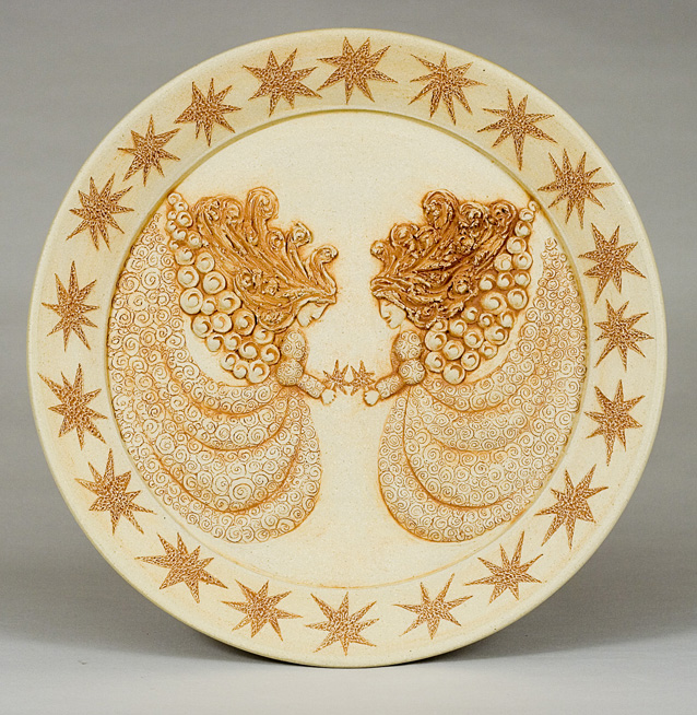
These are 2 new designs I finished on October 19 from graphically altering relief sculptures. The relief sculpture was done on a wall-hanging platter shape. The platter is visible on my website here. You can see that I did quite a bit of altering to make it into a graphic. I have shown the actual sculpture in a number of places, but the graphic alteration is completely new.

As I said in my previous post, I like the monochromatic effect I get with playing with and re-arranging my ceramic sculptures in this way. It gives another life to my ceramic creations and it is another art form I am just now discovering. I like working in the two mediums and this is a way for me to do that.

Right now I have the images for sale in my Etsy shop as greeting cards, but I may do more to make them into prints (& possibly other alterations down the road). Once I printed the greeting cards, they looked different from what was in my monitor, so I tried to represent them as best I could with the other two images (shown). Monitors display colors differently though, so it may be a futile exercise.


Music MYSPACE (hear clips)
My Etsy on-line store for purchasing some of my CDs and some of my art
My band site: Saratoga Faire
My Renaissance band MYSPACE: The Spirites Consort (hear clips)
Purchasing our Saratoga Faire CD on CD Baby

Tuesday, October 13, 2009

4 Unicorns: Unicorn II in Dayglow, Unicorn V in Red, Unicorn III at Dusk, Unicorn VI at Midnight


Note: the copyright watermarks do not appear in the actual art (needed for on-line display only).

These are 4 new unicorns I made from graphically altering relief sculptures. The relief was done on wall-hanging platter shapes. The platters are visible on my website here. You can see that I did quite a bit of altering. The pottery pieces were shown at Lower Adirondack Regional Arts Center for a 5-person invitational juried exhibit called Once Again in March of this year and I also sold the greeting cards in the art center shop concurrent to the exhibit. Later, I brought them to more shops.

I like the monochromatic effect I get with these alterations, something one sees at night, at dusk and at dawn, which is why some are titled that. It’s something I never tried before, but I like the effect and it gives another life to my ceramic creations.

Right now I have them for sale in my Etsy shop as greeting cards, but I may do more to make them into prints (& possibly other alterations down the road).

Right now they are printed on linen card stock from a giclee printer with archival inks (rated to last 100 years). They are also signed, so they are a little more special than my mass produced cards which use soy based inks and have barcodes. Sometimes I test new designs out in this way, printing a small number.

Music MYSPACE (hear clips)
My Etsy on-line store for purchasing some of my CDs and some of my art
My band site: Saratoga Faire
My Renaissance band MYSPACE: The Spirites Consort (hear clips)
Purchasing our Saratoga Faire CD on CD Baby